Introduction
This report is an activity for Hyper Island's Digital Management Masters program. Its objective is to present a scoped project for the author's workplace, Adevinta. The project intends to evaluate the feasibility of creating a global, modularised, and reusable set of visual interface components, known as a Design System: a solution that can potentially accelerate and standardize design and development decision-making across all the company's products.
The content is presented in two main sections. Part one introduces the topic, how it can potentially impact the business, and its effect on its primary stakeholders. The second part is a reflection of the key learnings and findings from part one, validation with leadership stakeholders, and how these insights will shape the idea moving forward.
Part One
The What: a way of standardizing interface design
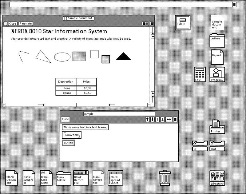
In 1981, the operating system Xerox Star (Fig. 1) became commercially available. With its launch, a different way of interacting with computers was introduced: the graphical user interface (GUI). The interface was now composed of different visual elements instead of command lines, so that users could interact with computers in a more intuitive way. In addition, the whole interface was composed of reusable visual components, such as the way menus look, the graphic of icons and folders, and how buttons were provided in the header of pages. This was not because of a lack of creativity or resources; instead, it was an intentional move towards standardization and consistency. Park et al. (2011) affirm that the overall usability of a digital product can benefit from this type of predefined standard, since users can learn and identify patterns across the product more easily. A now-known fact that was already understood when Xerox Star was created, judging by its interface.
The origins of these interface patterns can be traced to an earlier period. Alexander et al. (1977) published a book called A Pattern Language: Towns, Buildings, Construction (Fig. 2) that explored how the design of environments relies on "languages." So when creating an architectural project for a house or building, these languages can be used in the same way to communicate, so the patterns in the space can express intent and coherence.

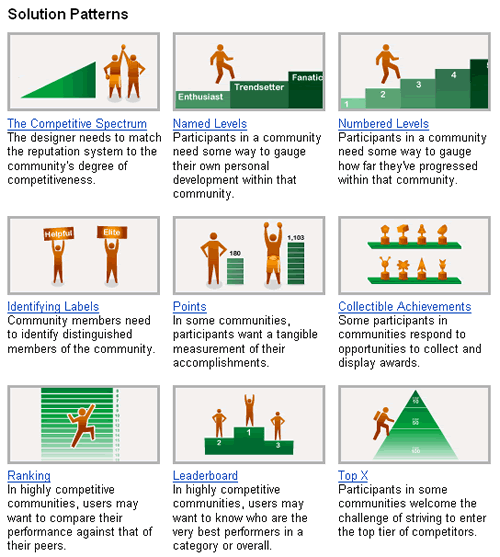
Over the years, more studies addressed how humans interact with computational interfaces, supporting the growth of the human-computer interaction field. These studies addressed topics such as how motivation can become a driving force for engagement with interfaces (Szalma, 2014), providing a deep understanding of how the digital design of an interface impacts the usage of software and websites. Yahoo! was one of the pioneers benefiting from some of these learnings: in 2004 it introduced its own design pattern library, created to orient designers and developers on creating guidelines (Fig. 3). This potentially marked the move from applying learnings previously only used for operational systems into websites as well.
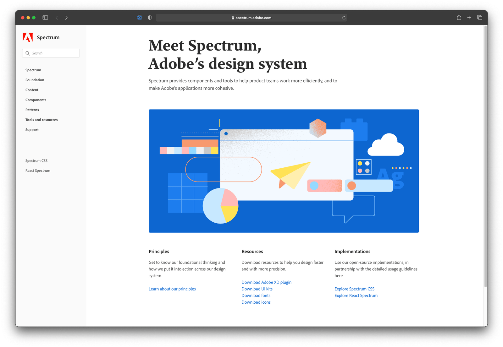
A new era of design pattern libraries started to emerge around 2017, when companies such as Airbnb, Uber, and IBM began to invest in this type of initiative (Fig. 4). This was the moment when large software companies realized that they could benefit from creating their own design pattern libraries, which started to be called Design Systems.
The main driver for this move was the understanding that the standardization of design patterns could offer more efficiency. A Design System provides a defined set of visual components and patterns, allowing different iterations to be designed and built faster, a process that enables designers and developers to spend less time on these phases and dedicate the extra time to researching and correcting problems. This evolution and adaptability are explained by Tidwell et al. (2020), who affirm that interface design patterns, like everything else, change to keep up with the times, something that can be noticed in their evolution from old operating systems to current startup mobile applications.
Internal learnings and experience with the opportunity
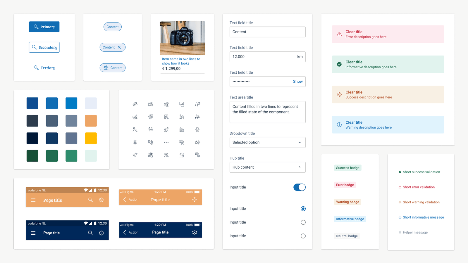
Back in 2019, the author of this project worked from scratch to create a minimum viable version of a Design System for two of the company's local brands, Marktplaats and 2dehands (Fig. 5). What started as a side project transformed into the author's full-time job in the middle of 2020, resulting in the company's first design position dedicated to Design Systems.
The author was appointed to a leading project position, and resources were granted for a dedicated team to be created. As demonstrated later, the local version of the Design System already exceeded the company's expectations on success metrics and efficiency. This success triggered the question of how this could be leveraged for the other products of the company, or in other words, what it would take to create a global Design System that could provide all the identified benefits for the company's entire portfolio of products.
The Where: taking advantage of a recent merger
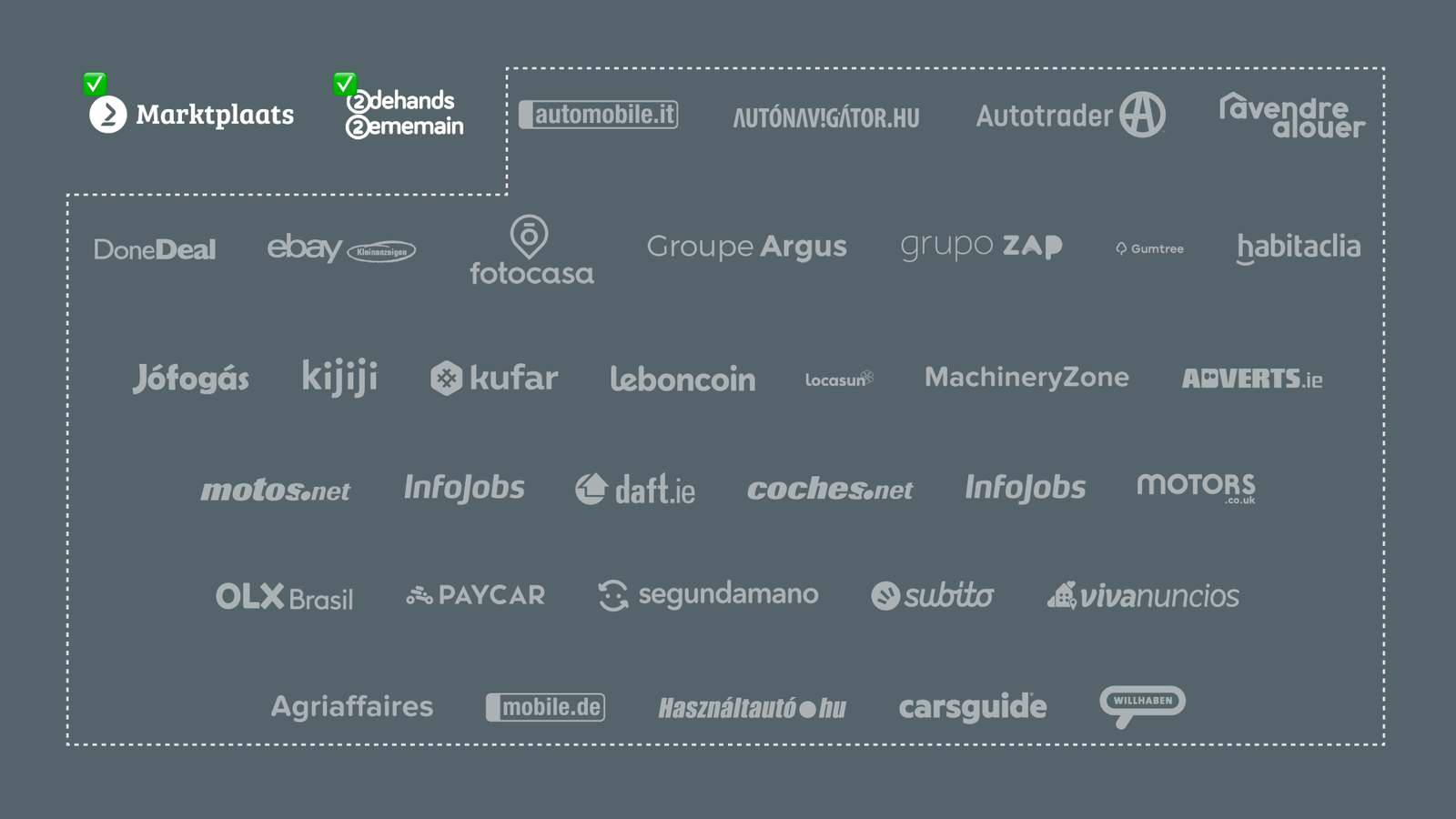
The intended project was conducted at the author's workplace, eBay Classifieds Group, which was acquired by Adevinta, an international family of local digital brands, as of June 2021. This merger created the leading global online classifieds specialist. Adevinta now operates an expressive portfolio of digital online classifieds products in 16 countries (Fig. 6), with an average of 1.5 billion visits and 250 million unique users each month (Adevinta, 2021).
Creating a Design System that supports two products (Marktplaats and 2dehands) was not an easy task, and it took almost two years to happen, so making the leap to more than thirty products posed a significant challenge. Each of these products is an individual local brand, but they all serve the same purpose of connecting buyers and sellers in their markets. Therefore, many of their features are common, so much of what had already been built could already be used. The main challenges would come from catering to local requirements, like local payment solutions and prominent brand characteristics such as brand fonts and colours.
The Why: a powerful solution to replicate great design
Visual components by themselves do not solve problems, and they should be provided with guidelines on how to be used. Santala (2020) affirms that guidelines in Design Systems serve two purposes: the first is to define constraints that limit certain aspects of the system, making it easier to achieve cohesive user experiences; the second is to offer a mechanism that allows good designs to be repeatable and reusable. With the combination of guidelines and ready-to-use visual components, designers and developers can not only work faster, but also increase the quality of their solutions.
The local Design System at Marktplaats and 2dehands could already be considered a successful initiative. Its broad offer of guidelines and ready-to-use components led to a rapid increase in adoption. When the project started, an initial assessment indicated that it would be able to reduce the average speed of delivery from problem definition to implementation (Fig. 7) by half.

A recent assessment of this metric over the following six months demonstrated even better results than initially anticipated. Besides achieving 100% adoption by all the product teams on these two local products, the average speed of delivery was reduced by three times compared to the previous way of working without the Design System (Fig. 8).

Design System considerations regarding accessibility and brand recognition
There are also benefits from a brand perspective in using a Design System. Pyrhönen (2019) affirms that providing a consistent GUI across a set of digital products can increase a company's brand recognition. Besides gains in productivity, consistency, and brand image, a Design System can also be an incredible way to bring accessibility and inclusion to a digital product. Accessibility is often ignored in digital products: according to AbilityNet (2018), over 90% of websites don't even meet single-A compliance regarding the WCAG (Web Content Accessibility Guidelines), an alarming statistic considering that an estimated 24% of the world's population has some form of disability (Donovan, 2020).
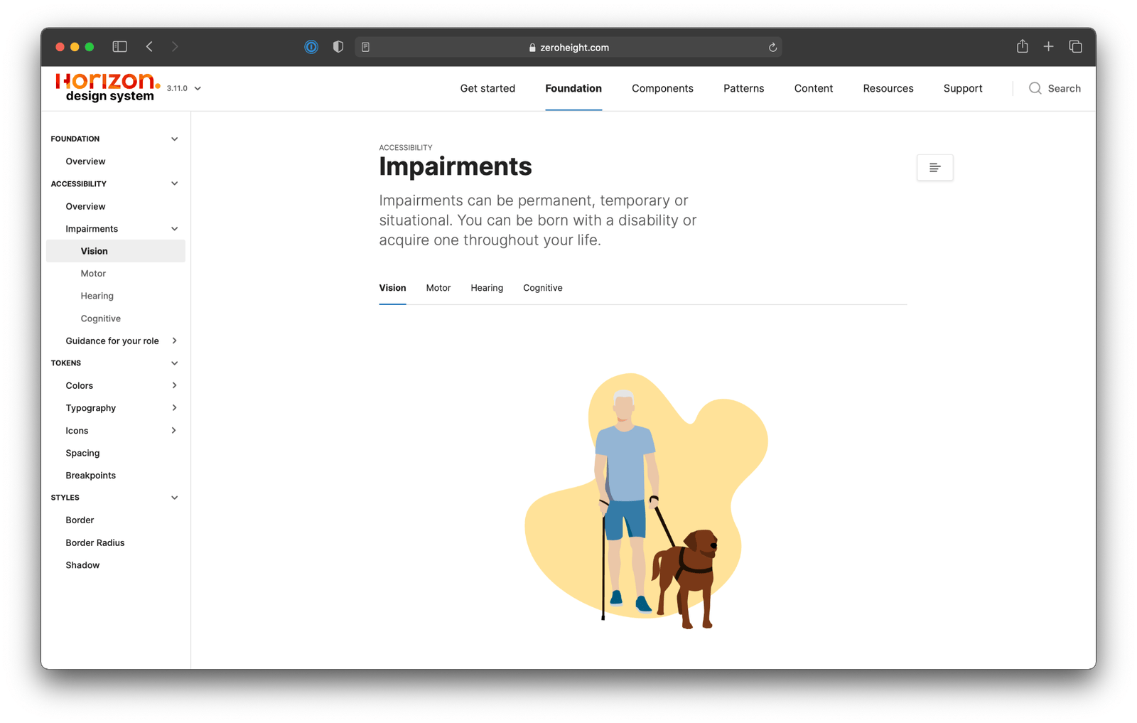
The way a Design System contributes to accessibility is simple: once a good design is made, it becomes repeatable. Its components can be created on the design side considering accessibility requirements such as minimum interactive areas, font sizes, and colour contrast, among other recommendations. The local Design System already considered accessibility from the beginning of the project. It also went a step further by providing informative content about how impairments affect the experience of users, built directly into its guidelines (Fig. 9), a meaningful win for good usability and accessibility best practices, since anyone using it automatically complies with high quality standards.
The Who: changing the way all designers and developers work
The project's primary stakeholders are designers and developers, so their collaboration during this assessment phase for a global Design System is crucial. Moreover, it's a chance for them to help redefine and reshape how these practices will work for years to come. The decision to adopt any kind of global solution comes with potential pros and cons. This validation phase intends to understand these issues, uncover potential risks, and learn from experienced people who had already implemented this type of solution outside of the company. Considering that this was still an exploratory validation, some long-term plans were not shared with stakeholders, since doing so could potentially create a bias towards a final solution. Some information was also considered confidential and was not shared with external people. Considering these different information layers, three distinct phases of validation took place:
First validation
- Stakeholders: 1 (direct manager)
- Position: Head of Design
- Country: Netherlands
- Method: 1:1 meeting
- Go/no-go: Proceed with the project
This stakeholder was already a supporter of the current local Design System, so the focus of the validation was on how important a global solution would be for future ways of working, especially in the new merger situation, with expanded markets and a company triple the size it was before. The primary outcomes from the conversation were:
- With the increased number of designers working together, a solution like a global Design System can make it easier to work on solutions that require cross-product collaboration.
- There is a need to cater for the speed at which changes are implemented in the Design System, otherwise teams can be blocked waiting for the system to adapt to their local market needs.
Second validation
- Stakeholders: 7 (current Design System team)
- Positions: UX Designer, Android developers, iOS developers, Quality Assurance analyst, and Engineering manager
- Countries: Netherlands
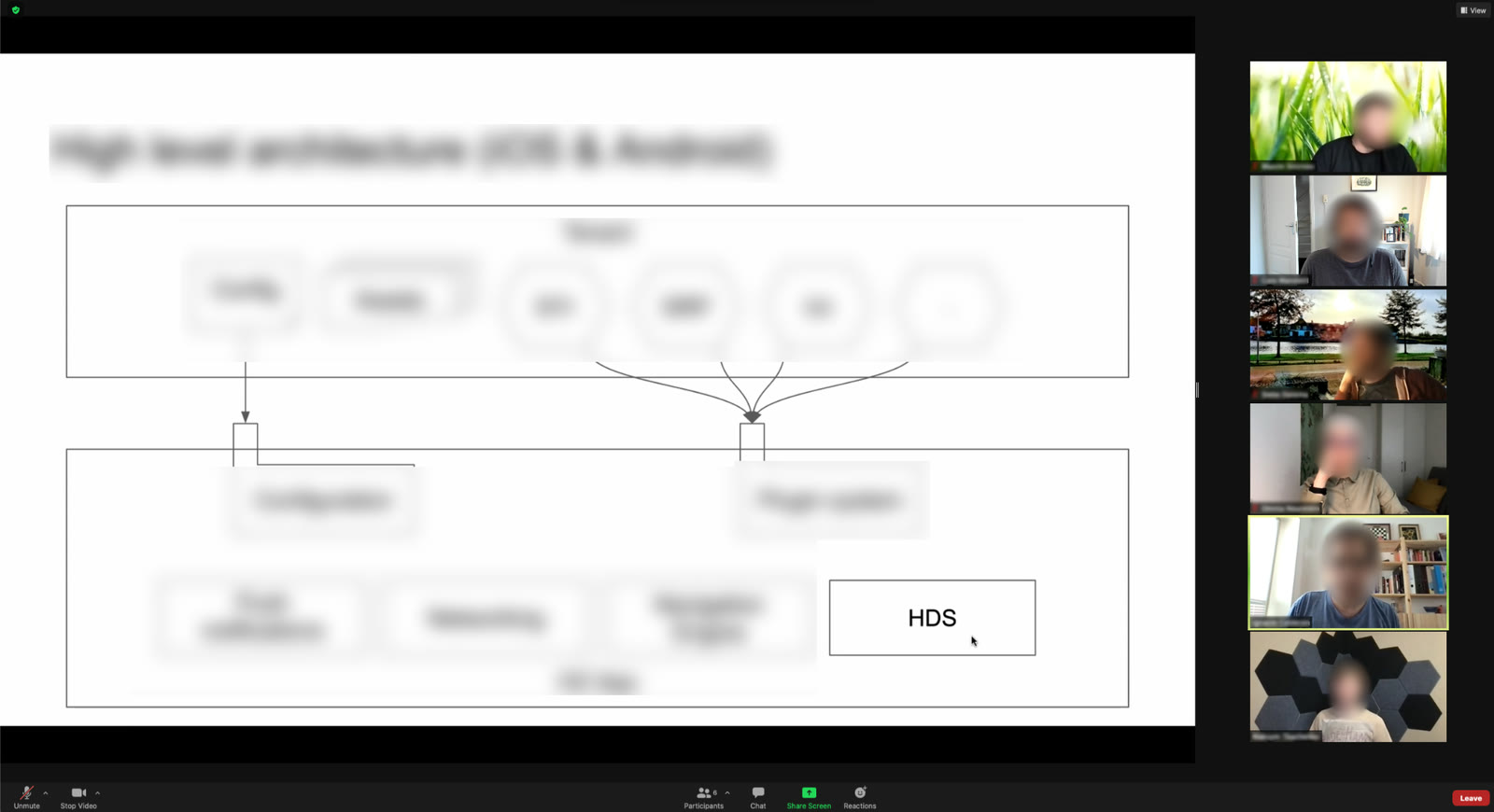
- Method: Meeting with pitch presentation (Fig. 10)
- Go/no-go: Proceed with the project
The team saw the move from a local approach to a global one as a natural next step, but a few concerns were raised related to project requirements, since a project like this needs numerous technical assessments before it can thrive, such as:
- How to support different development languages and platforms, since there were no guidelines or global agreement about standards across the company.
- How the approval process for changes would happen, considering that the Design System team would not have the local context of user needs, which could lead to a potentially onerous approval and update process, defying the purpose of the solution being a more efficient way of working.
Third validation
- Stakeholders: 12 (external Design System specialists)
- Positions: UX Designers and Lead UX Designers
- Countries: United States, Brazil, and Portugal
- Method: Semi-structured interviews with individuals and groups (Fig. 11)
- Go/no-go: The project itself was not shared with these interviewees

These conversations focused on learning from designers who currently work with global design systems and how they handle its challenges. The main learnings were:
- Guidelines should focus on how to use the Design System instead of describing all its rationale and behind-the-scenes work; for example, a designer or developer should know when to use a button more than how it was created and built.
- A Design System goes beyond components and patterns; it should ultimately help guide users towards their flows and journeys.
- Changes of any kind should be shared as early as possible, so stakeholders have time to review how the updates will impact what they've already built.
Part Two
Main learnings from part one
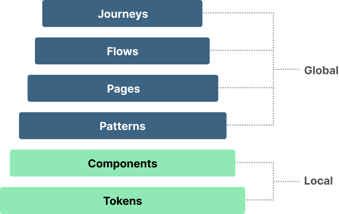
Part one was crucial to assess and validate the project's scope. The overall sentiment towards the project was positive, but there were multiple questions yet to be answered. One of the main findings was that a Design System doesn't stop at patterns and pages: it can go much further in complexity. The layers identified so far are:
- Tokens: the smallest Design System elements, used as a foundation for more complex elements.
- Components: interactive elements built with tokens, with distinct functions that can be customized based on design needs.
- Patterns: combinations of components, such as launching a new feature or creating a signup modal.
- Pages: complete page templates that can be easily manipulated and adapted to test hypotheses quickly.
- Flows: a sequence of tasks across pages to accomplish a task.
- Journeys: the motivation to use a digital product, composed of one or more flows to solve a problem.
These insights also helped highlight how the elements that compose a Design System connect with local and global needs (Fig. 12): for example, the base layers reflect the local product's brand, so they need to be catered locally, while the top layers can be created with a global mindset.
Several other findings were identified that will impact the scope and direction of the project moving forward, the main ones being:
- Understanding how cultural and platform differences across local markets can be considered, followed by how customization for local solutions can be possible without impacting the overall system's purpose.
- Learning how to decentralize a global solution, so individuals can contribute and collaborate in a scalable way.
- Exploring how to create contribution and collaboration models.
A proposed scope for the project
The project objective is to create a global Design System that can be used by all of Adevinta's products (Fig. 13), helping designers and developers quickly build solutions for any device, platform, and brand. It will aggregate visual guidelines and design intelligence that allow situations to be framed into a layered decision-making framework. The project will be considered successful if the following objectives are achieved:
- It offers a sustainable and better way for designers and developers to make decisions regarding their everyday work.
- It is adopted by the majority (85% or more) of the intended stakeholders.
- It offers a scalable and manageable source of truth for designers and developers.
- It improves collaboration with non-designer stakeholders.
Validation with the company leadership team
For the project to move forward, it needed to be approved by the leadership team (LT), composed of the most senior representatives of product, technology, data, and design. This group is responsible for the allocation of resources and priority of projects and teams.
Leadership Team validation
- Stakeholders: 3
- Positions: Chief Product/Technology Officer, Head of Engineering, and Head of Design
- Countries: Netherlands
- Method: 1:1 meetings and a pitch presentation
- Decision: Proceed with the project
The main learnings and feedback were:
- The current metrics might not work for a global approach, since each local team works with different metrics; a new, unified success metric needs to be agreed upon among users.
- The LT was concerned that the new challenge is exponentially more complex, and that the current approach and methods would need to be scaled accordingly.
- As a suggestion, the LT recommended a gradual approach to incorporating other products into the project; having all of them on board at once from the beginning could be risky.
- The LT judged the initiative to be promising for the company's future, but felt it needed a more robust strategy and planning. The project moved forward to the strategy phase.
Next steps for the project
There is a long and challenging road to creating a genuinely global Design System. As learned previously, its scope goes way beyond offering a library of visual guidelines; instead, it should be catered to the company's user needs and expectations, carrying the intelligence and rationale behind the products' ways of solving problems. This project would be expanded and rescoped based on the insights collected in the validation phase, continuing as the author's final work for the Industry Specialization Project of Hyper Island's Digital Management Masters program.
Conclusion
Considering the recent company merger, the timing for the project was compelling. It creates a strong case to improve the way designers and developers at Adevinta work across its entire product portfolio. The local Design System team at Marktplaats also felt confident to pursue the challenge of becoming a global initiative; the learnings from the past two years of the project created a solid foundation for that work. Taking on a global solution would not be an easy journey, and a considerable effort still needed to happen to create a proper strategy for the project. Hopefully, the soon-to-start Industry Specialization Project could serve as a platform for that work to happen.
From a design perspective, this project was also an opportunity to create the first global position for Design Systems, increasing the participation of the design practice in the company's strategy. This could raise the company's design maturity and create an environment where design thrives, helping attract more talent and create a culture where the design practice is not only seen, but heard, across all levels of the hierarchy.
Bibliography
- AbilityNet (2018) Inaccessible websites keep disabled people out of work, AbilityNet tells government taskforce. Available at: abilitynet.org.uk.
- Adevinta (2021) Adevinta: About | LinkedIn. Available at: linkedin.com.
- Alexander, C., Ishikawa, S. and Silverstein, M. (1977) A Pattern Language: Towns, Buildings, Construction. New York: Oxford University Press.
- Donovan, R. (2020) Design Delight from Disability – 2020 Annual Report: The Global Economics of Disability | Return on Disability. Available at: rod-group.com.
- Park, W. et al. (2011) 'A factor combination approach to developing style guides for mobile phone user interface', International Journal of Industrial Ergonomics, 41(5), pp. 536–545. doi: 10.1016/j.ergon.2011.04.002.
- Pyrhönen, E. (2019) Hack the Design System: Revolutionize the Way Your Organization Scales Design, edited by M. Reyes. Erscheinungsort unbekannt: idean Publishing, part of Capgemini Invent.
- Santala, S. (2020) 'Optimising User Interface Layouts for Design System Compliance'. Available at: aaltodoc.aalto.fi.
- Szalma, J. L. (2014) 'On the Application of Motivation Theory to Human Factors/Ergonomics: Motivational Design Principles for Human–Technology Interaction', Human Factors, 56(8), pp. 1453–1471. doi: 10.1177/0018720814553471.
- Tidwell, J., Brewer, C. and Valencia, A. (2020) Designing Interfaces: Patterns for Effective Interaction Design. Third edition. Sebastopol, CA: O'Reilly.